I consigli di Polti
Which steam cleaners do you know? Let's discover them together
Features and advantages of steam cleaners
Leggi di più
Ways to organize your kids closet with labels
How to use labels to keep children’s wardrobe organized.
Leggi di più
Tricks and tips for preparing your home for Spring
How to get prepared for Spring cleaning
Leggi di più
The things you wouldn't expect to clean with steam
All the advantages of cleaning your house with steam
Leggi di più
Suggestions for cleaning the house before going on holiday
How to organise house cleaning before you leave
Leggi di più
Steam and vacuum cleaning: the perfect method to remove mites from the mattress
Test the power of steam and vacuum cleaning against the mites of the mattress.
Leggi di più
Quick guide to getting the best from your steam cleaner
Our tips for a clean and hygienic home with the power of a steam cleaner.
Leggi di più
Pet allergies: how to recognise them and defend yourself
How to eliminate animal allergens when cleaning the house
Leggi di più
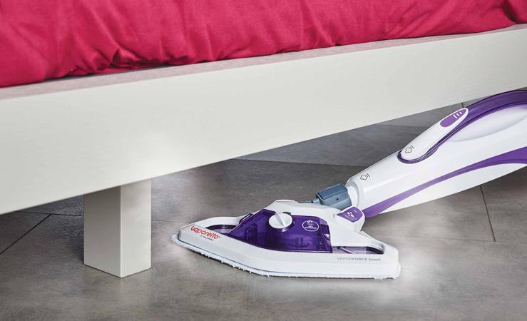
Oh, the places your steam cleaner can go
Read all the different ways we can use steam to get our home clean, chemical-free.
Leggi di più

Lecologico in the fight against autumn allergies
How to control allergies by cleaning your house the right way
Leggi di più
How to get the perfect wardrobe
Polti ideas to ensure that your stored clothes stay fresh and wrinkle-free.
Leggi di più
DIY Reusable dusting cloths
It only takes a few natural ingredients to make your own dust-catching electrostatic cloths.
Leggi di più
Creative solutions for living with pets
How to keep your home tidy while living with pets
Leggi di più
Back to school: let's get ready to deal with stains
Stains on school aprons and clothes: all the tricks to eliminate them
Leggi di più
10 alternative uses for vinegar
How to use vinegar as a natural ally for ecological cleaning and housekeeping, and also for wellness purposes.
Leggi di piùGriglia
Responsive modifiers enable specifying different column sizes, offsets, alignment and distribution at xs, sm, md & lg viewport widths.
<div class="row">
    <div class="col-xs-12
                col-sm-8
                col-md-6
                col-lg-4">
        <div class="box">Responsive</div>
    </div>
</div>
Fluid
Percent based widths allow fluid resizing of columns and rows.
.col-xs-6 {
  flex-basis: 50%;
}
Simple Syntax
All you need to remember is row, column, content.
<div class="row">
    <div class="col-xs-12">
        <div class="box">12</div>
    </div>
</div>
Offsets
Offset a column
<div class="row">
    <div class="col-xs-offset-3 col-xs-9">
        <div class="box">offset</div>
    </div>
</div>
Auto Width
Add any number of auto sizing columns to a row. Let the grid figure it out.
<div class="row">
    <div class="col-xs">
        <div class="box">auto</div>
    </div>
</div>
Nested Grids
Nest grids inside grids inside grids.
<div class="row">
    <div class="col-xs">
        <div class="box">
            <div class="row">
                <div class="col-xs">
                    <div class="box">auto</div>
                </div>
            </div>
        </div>
    </div>
</div>
Alignment
Add classes to align elements to the start or end of a row as well as the top, bottom, or center of a column
.start-
<div class="row start-xs">
    <div class="col-xs-6">
        <div class="box">
            start
        </div>
    </div>
</div>
.center-
<div class="row center-xs">
    <div class="col-xs-6">
        <div class="box">
            start
        </div>
    </div>
</div>
.end-
<div class="row end-xs">
    <div class="col-xs-6">
        <div class="box">
            end
        </div>
    </div>
</div>
Here is an example of using the modifiers in conjunction to acheive different alignment at different viewport sizes.
<div class="row center-xs end-sm start-lg">
    <div class="col-xs-6">
        <div class="box">
            All together now
        </div>
    </div>
</div>
.top-
<div class="row top-xs">
    <div class="col-xs-6">
        <div class="box">
            top
        </div>
    </div>
</div>
.middle-
<div class="row middle-xs">
    <div class="col-xs-6">
        <div class="box">
            center
        </div>
    </div>
</div>
.bottom-
<div class="row bottom-xs">
    <div class="col-xs-6">
        <div class="box">
            bottom
        </div>
    </div>
</div>
Distribution
Add classes to distribute the contents of a row or column.
.around-
<div class="row around-xs">
    <div class="col-xs-2">
        <div class="box">
            around
        </div>
    </div>
    <div class="col-xs-2">
        <div class="box">
            around
        </div>
    </div>
    <div class="col-xs-2">
        <div class="box">
            around
        </div>
    </div>
</div>
.between-
<div class="row between-xs">
    <div class="col-xs-2">
        <div class="box">
            between
        </div>
    </div>
    <div class="col-xs-2">
        <div class="box">
            between
        </div>
    </div>
    <div class="col-xs-2">
        <div class="box">
            between
        </div>
    </div>
</div>
Reordering
Add classes to reorder columns.
.first-
<div class="row">
    <div class="col-xs-2">
        <div class="box">
            1
        </div>
    </div>
    <div class="col-xs-2">
        <div class="box">
            2
        </div>
    </div>
    <div class="col-xs-2 first-xs">
        <div class="box">
            3
        </div>
    </div>
</div>
.last-
<div class="row">
    <div class="col-xs-2 last-xs">
        <div class="box">
            1
        </div>
    </div>
    <div class="col-xs-2">
        <div class="box">
            2
        </div>
    </div>
    <div class="col-xs-2">
        <div class="box">
            3
        </div>
    </div>
</div>
Reversing
.reverse
<div class="row reverse">
    <div class="col-xs-2">
        <div class="box">
            1
        </div>
    </div>
    <div class="col-xs-2">
        <div class="box">
            2
        </div>
    </div>
    <div class="col-xs-2">
        <div class="box">
            3
        </div>
    </div>
</div>
Gallery fancybox
Overlay youtube

Lazy image
